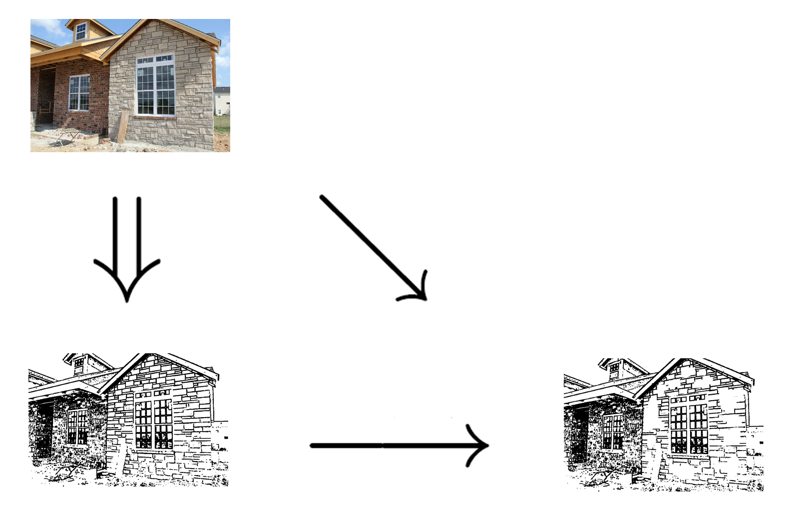
In "Drawing as Translation",
I talked about restoring the balance of a drawing by, for
example, erasing patches of brick. I used the word "balance"
loosely. Artists will know what I mean, but it's an idea
that's as hard
to pin down as
it is to define "beauty".
However, I want to suggest that
in principle, there may be a mathematical way to formulate it.
I hinted at that when I mentioned generalised inverses and
the diagram below, and in this essay,
I'll explain.
I said that restoring balance by removing bricks is what mathematicians would call a generalised inverse. It's an operation that undoes another operation, not exactly, but as closely as the language permits. But generalised inverses are (sometimes) actually special cases of a more general notion called an adjunction. Adjunctions are mathematical power tools, often used for describing approximations of one mathematical object by another. In effect, they translate one into the other when the objects don't match precisely, so the translation can't be exact, but only as close as possible. I hypothesise that detexturing to restore balance can be formulated as an adjunction. More generally, perhaps adjunctions can be used to define "balanced" or "aesthetic".
This is something that mathematicians have a long history of trying to do. Perhaps it started with the book Aesthetic Measure by algebraist Garrett Birkhoff. Here's a Science News article explaining Birkhoff's formula: "A Measure of Beauty" by Ivars Peterson, 20 May 2004.
By the way, the arrows in my diagram come from a diagram taken from "Heteromorphisms and Adjoint Functors" Wayback by David Ellerman, 2012. He has a particularly nice way of explaining adjunctions, less involved than the standard method. A succinct formulation of how they're related, via the notion of cograph of a functor, can be found at the nLab page "heteromorphism".
The notion of adjunction depends on a shift in mathematical thought that started in the late 19th century, and I want to start introducing that now.
This shift was the change from considering mathematical objects in isolation, to considering them as points in a network of related objects, all of which share the same abstract structure. It eventually led to the topic called category theory, of which adjunction is one of the most important concepts. It was an extremely fruitful change in mathematical culture, and it may be a fruitful way to think of drawings: not as single objects, but as a family of relatives.
Here's an example. What if you're translating from a language into the same language, but with a coarser resolution? For example, if you're trying to précis a novel, or squeeze the gist of a newspaper article into its lead paragraph, or display an image at very low resolution? This is one of the themes in Douglas Hofstadter's essay "Analogies and Roles in Human and Machine Thinking", from his book Metamagical Themas. In the PDF, this starts on page 547. I recommend the essay, by the way, to every translator. It has many insights about what to do when you can't translate a text exactly. How, for example, would you translate "The First Lady of Britain" from American to Thatcher-era English? Hofstadter gives many conceptual experiments — many examples of analogies and "slipped" analogies — to clarify the problems involved. Getting back to drawing, the diagram and commentary below are about how to render letters at lower and lower resolution while still retaining their style.

FIGURE 24-12. Helveticality emerging from the gloom. Proceeding from bottom to top, we have a series of increasingly fine-grained dot matrices within which to maneuver. Clearly, both the 'a'-ness and the Helveticality get easier and easier to recognize as you ascend — especially if you look at the page from a few feet away. Proceeding from left to right, we have a series of increasingly letter-savvy programs doing the choosing of the pixels to light up. (As a matter of fact, the rightmost column is a very light touch-up job of the third column, done by a human.)
The leftmost column is done by a totally letter-naive program. It takes the curvilinear outline of the target shape and turns on all pixels whose centers fall within that outline.
The second and third columns are the work of an algorithm that has information about zones likely to be characteristic and critical for recognizability. It mathematically transforms the original outline so that the critical zones are disproportionately enlarged (the way your nose is enlarged when you look at yourself in a spoon). It then applies the naive algorithm to this new outline (pixels light up if and only if they fall inside). This amounts to an interesting trade-off: sensitivity in the critical zones is enhanced al the sacrifice of sensitivity in less critical zones. Consequently, some pixels are turned on that do not fall inside the letter's true outline, while some that do fall inside that outline remain off It's a gamble that usually pays off but not always, as you can see by comparing the first and second letters in, say, the third row.
The difference between the second and third columns is that in the second column, the critical zones are crude averages fed to the program and don't even depend on the letter involved. In the third column, however, the program inspects the curvilinear shape and determines the zones itself according to its knowledge of standard letter features such as crossbars, bowls, posts, and so on. Then it uses these carefully worked-out zones just the way the second algorithm uses its cruder zones: by distorting the true outline to emphasize those zones, and then applying the naive algorithm to the new outline.
But no matter how smart a program you are, the problem gets harder and harder as you descend towards typographical hell — matrices too coarse to capture essential distinctions. En route to hell, more and more sacrifices are made. Helveticality goes overboard first, then 'a'-ness; and from then on, entropy reigns supreme. But just before that point is the ultimate challenge — and only people can handle it, so far. [Computer graphics by Phill Apley and Rick Bryan.]
In the Helveticality diagram, each column of a's is a family of drawings. As the resolution reduces, one drawing gets transformed into the next by enhancing the zones deemed most important for recognising the letters.
An artist drawing people rather than letters would
transform according to scale in a similar way.
The cartoons below depict
people in the foreground and in the background. In the first,
notice how I have enhanced the expression on the woman's
face. In the second, see the upraised arms of
the "Foresters in the crowd", emphasised relative
to the rest of the body.
Significant features in the smaller figures are
made easier to recognise. It's a transformation
which
I call "inflating
significant zones".

I said that in Hofstadter's Helveticality example,
one letter gets transformed into the next by
enhancing the zones deemed most important for recognition.
Here's this with the transformations made
explicit as arrows:

In category theory, transformations are called "morphisms". A "category" is a collection of objects, all sharing the same structure. Think of these as points, and the morphisms as arrows between them. The morphisms have to preserve the structure. What that means depends on the objects. For the letters, it means preserving the zones critical for recognition. For the modular arithmetic example below, it means preserving the special rôles of 0 and 1, and the essential nature of addition and multiplication.
I want to insert a mathematical example here. It's not exactly analogous to the above, but it may be useful. It concerns modular arithmetic. Take the addition table for the non-negative integers, and make from it another table where the addition "wraps round" whenever the answer is greater than a specific integer N. When N is 12, we have the familiar clockface arithmetic, where 11+1=0, and 11+2=1, and 5+7=0, and 5+8=1, and so on. The resulting addition table is wildly different from normal addition: for a start, it's finite. But it does have properties in common. For example, 0 is still special in that it does nothing when added. If we make a clockface-multiplication table, in which 2*6=0, and 3*4=0, and 3*5=3, and so on, then 0 is special there too, because multiplying by it still always gives 0. And so is 1 special: multiplying a number by it still gives that number. And addition and multiplication are still commutative: that is, it doesn't matter which order you do them in.
So the transformation — the morphism — between our normal arithmetic and the clockface arithmetic preserves essential aspects of structure.
But what kinds of morphism can we find between drawings? I've mentioned two: appointing a representative (a.k.a. detexturing), and inflating significant zones. Are there others?
I should add that at the moment, I feel as though this section is rather forced. I was very pleased when I invented the idea of an "appointing a representative" morphism, because it seemed to open the way for adjunctions to be applied to drawing. Adjunctions, and category theory generally, don't make sense without morphisms. But are there enough different kinds of morphisms to be interesting, or is this just a trivial idea that doesn't lead anywhere?
I asked the above when I first wrote this webpage. I now think it is useful to look for other morphisms. One reason is that adjunctions can represent optimisation, and there is some research that sees depiction as optimisation. Indeed, that's what I was doing at the end of Drawing as Translation". See "Drawing as Optimisation" for a discussion.
Thinking of art in those terms enables me
to see as close analogues the tricks
played by Doust and Grenfell in
"Drawing in Translation", and the
superficially very different trick
played by Schwitters
below.

Another reason is that, via the concept of semiotic morphism, a well-stocked zoo of aesthetic morphisms would tie up with work on conceptual blending and semiotic blending. The EU takes this work seriously enough to have made it a pillar of the recent EU CoInvent project on Concept Invention Theory.